ARE CO.™ // Brand Director
What is ARE CO.™?
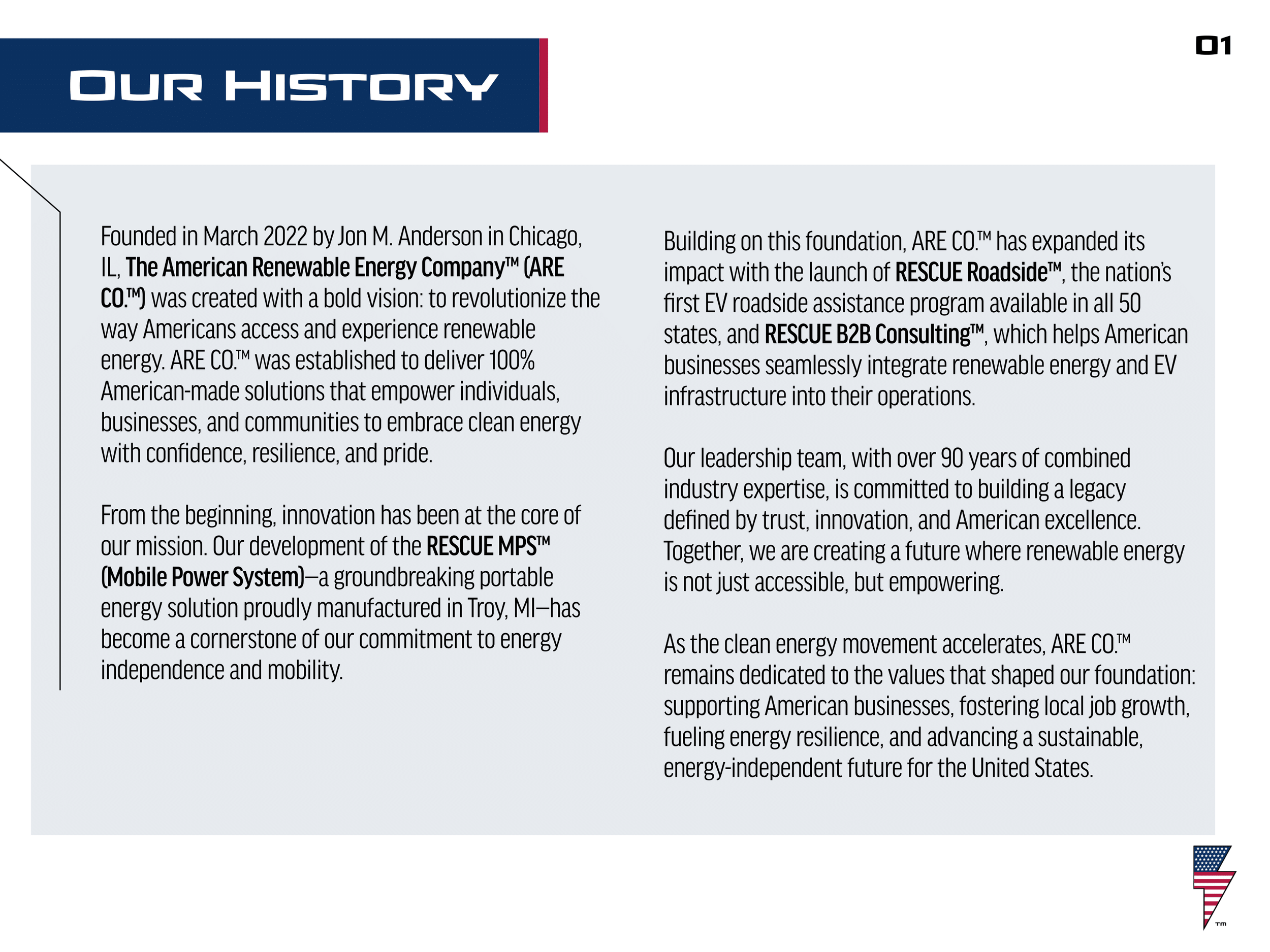
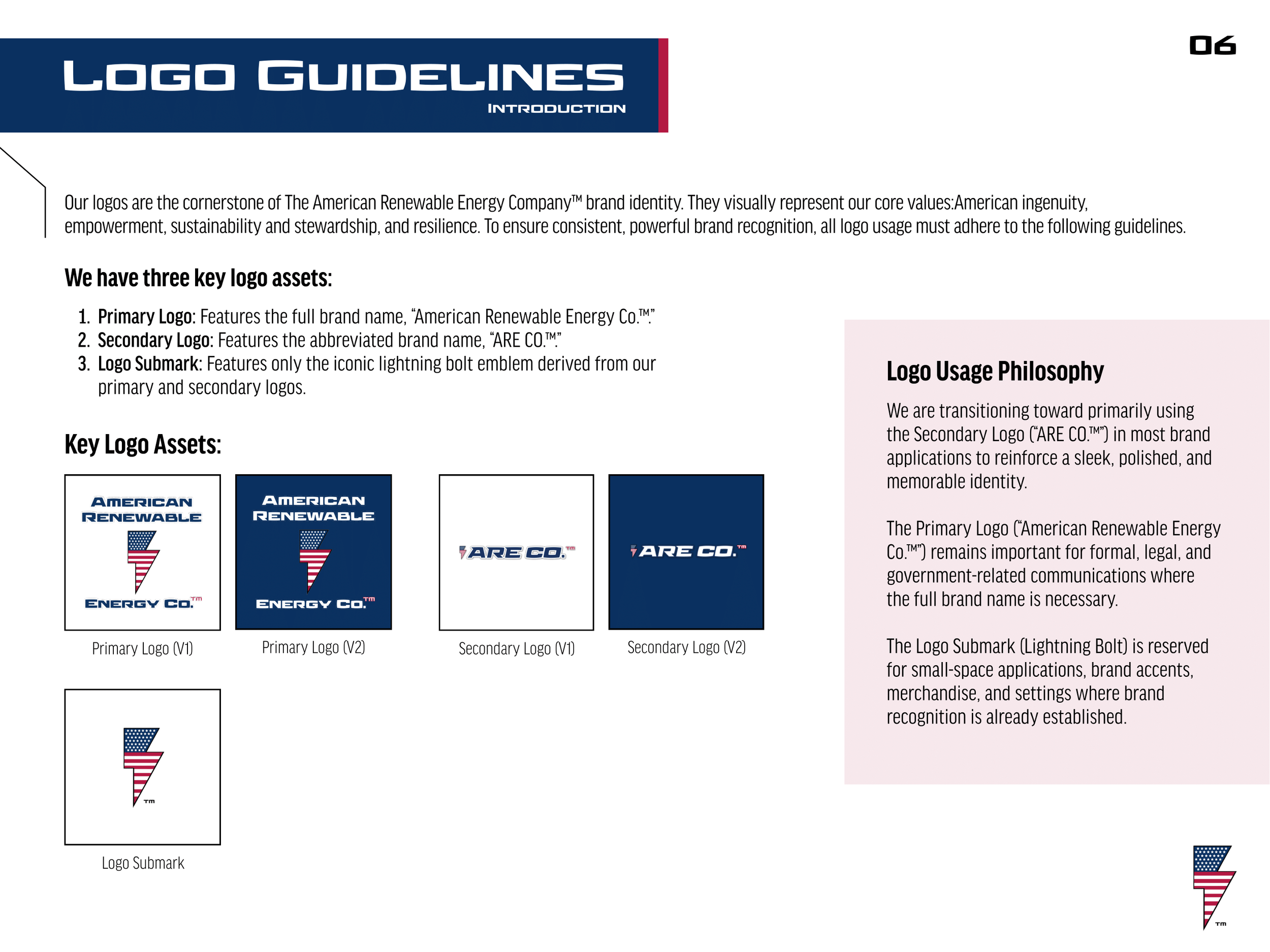
The American Renewable Energy Company, LLC. ™ (ARE CO.) was started in March of 2022 out of Chicago, IL, to expand consumer availability of EVSE (electric vehicle supply equipment) throughout America and to provide American businesses with 100% American made EVSE products and services.
Objective: When joining ARE CO. in 2023 as their Brand Director my goal was to develop and expand their brand by creating a memorable and cohesive brand identity system that could be used to scale alongside the company as they grew in size.
Skills Used
Branding
Advertising
Marketing
Social Media Management
User Experience Design
Graphic Design
Logo Design
Project Management
Creating a Brand Guide
“Brand Guides are a fundamental part of any successful brand as consistency is key when it comes to creating a strong memorable brand identity.”
-
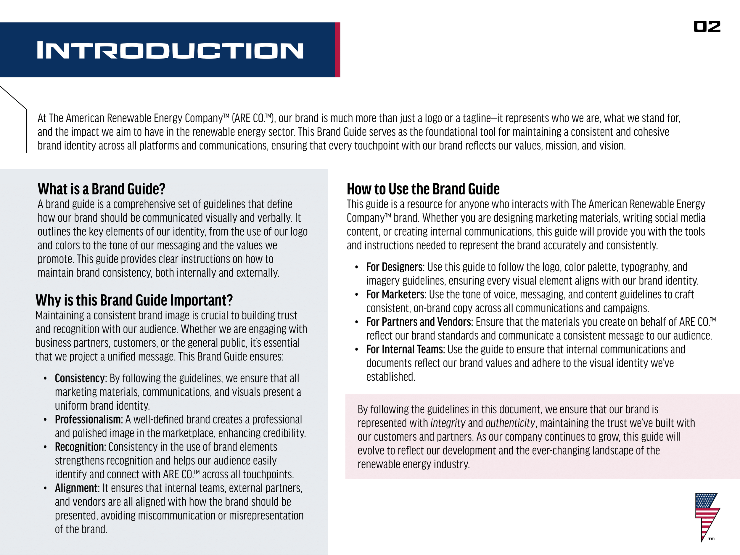
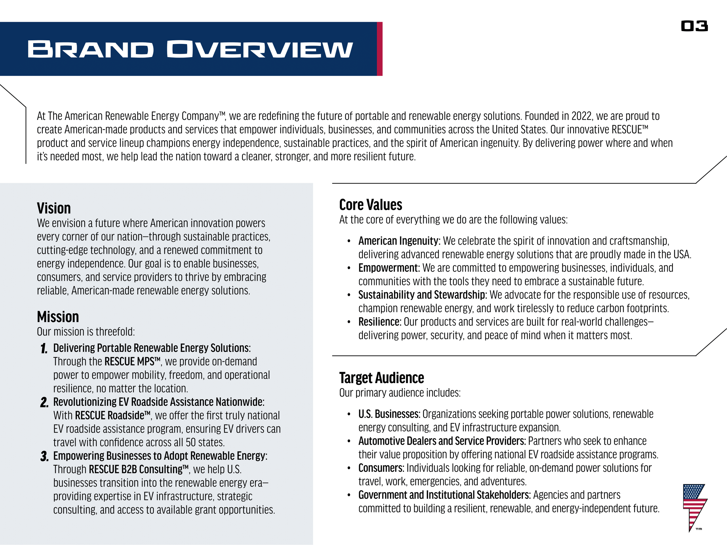
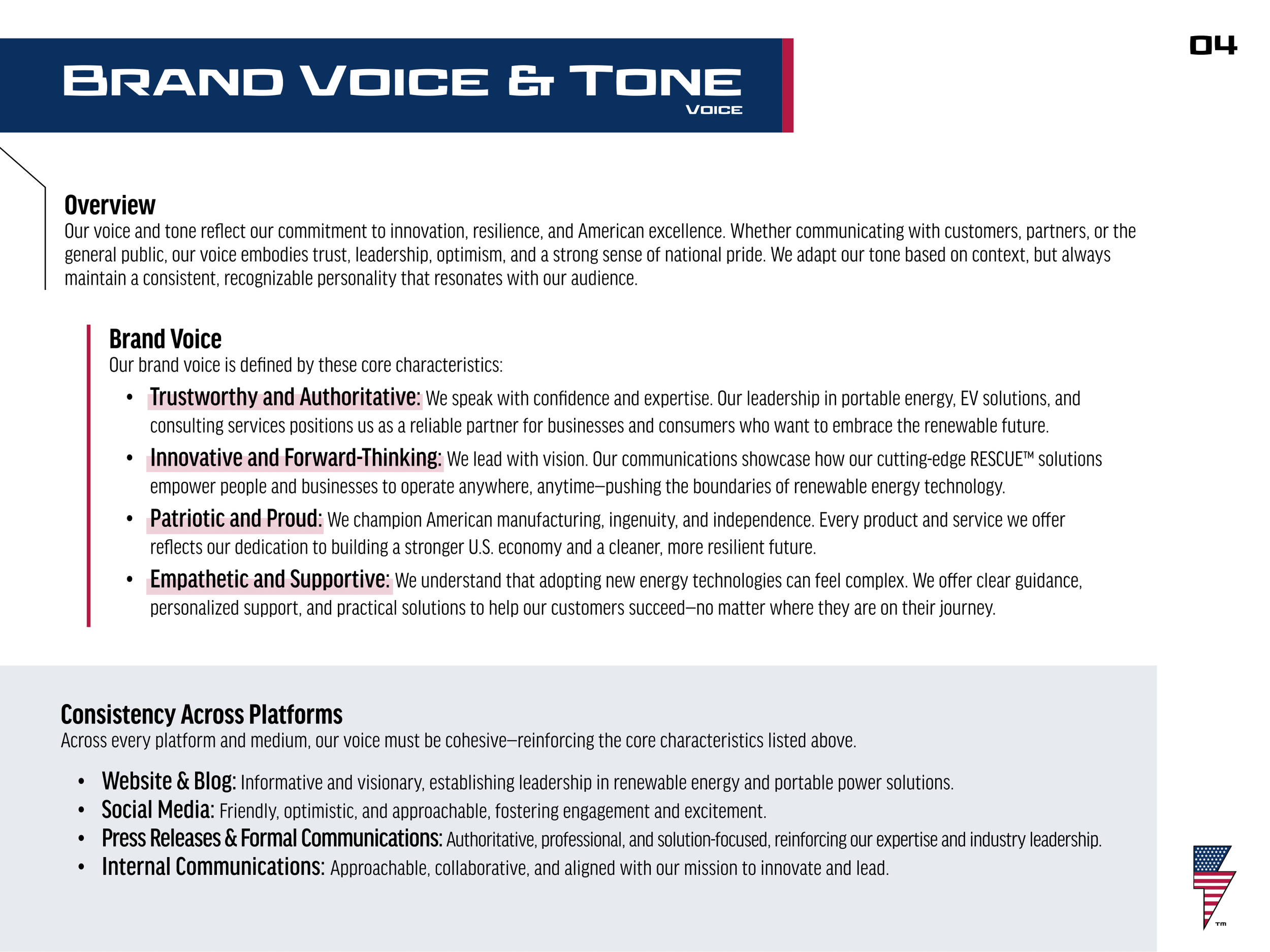
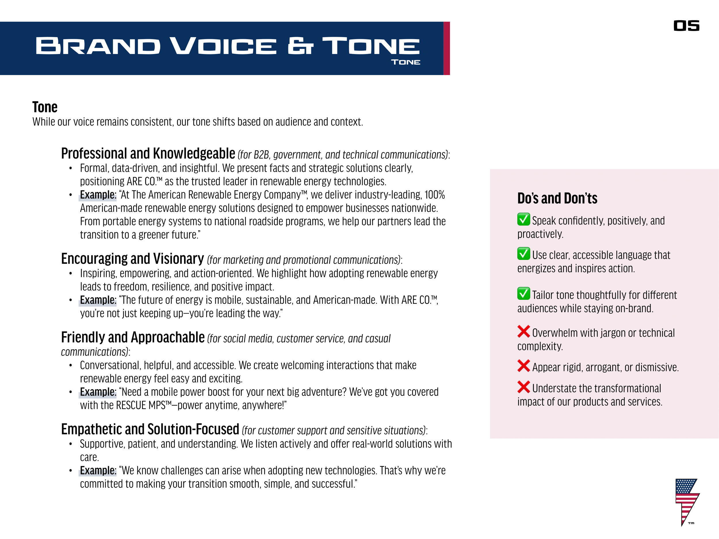
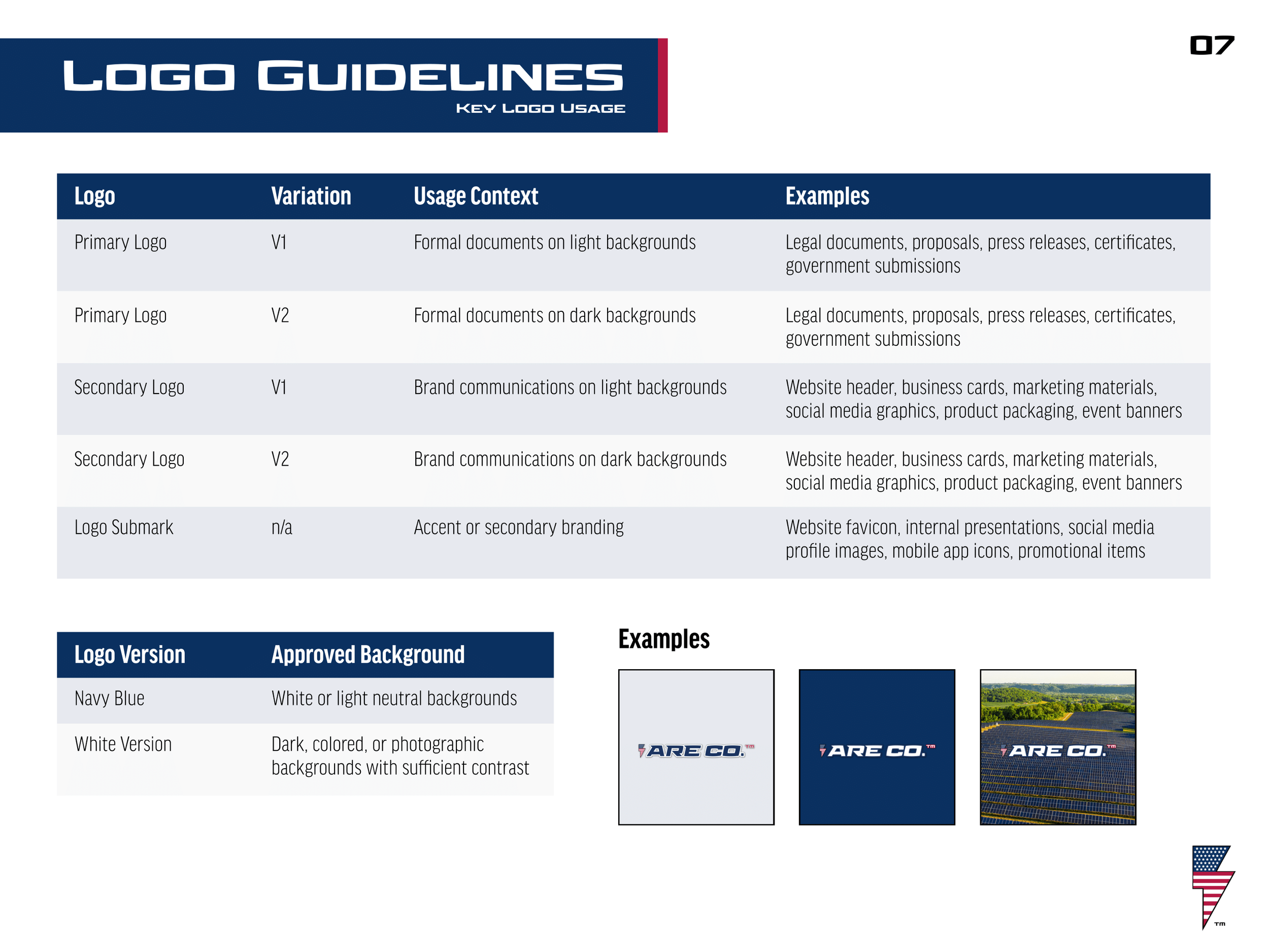
My goal in creating a comprehensive brand guide for ARE CO. was to design a document that could guide anyone who was representing the ARE CO. brand through how the brand should be communicated verbally and visually. Brand Guides are a fundamental part of any successful brand as consistency is key when it comes to creating a strong memorable brand identity. The guide I created for ARE CO. covers an array of topics including Brand Voice & Tone, Logo Usage, Design Assets, Typography, Color Palettes, Imagery & Photography, Social Media Guidelines, and more. Inside you’ll find examples, do’s and don’ts, templates, tips, and general advice for each of the topics listed.
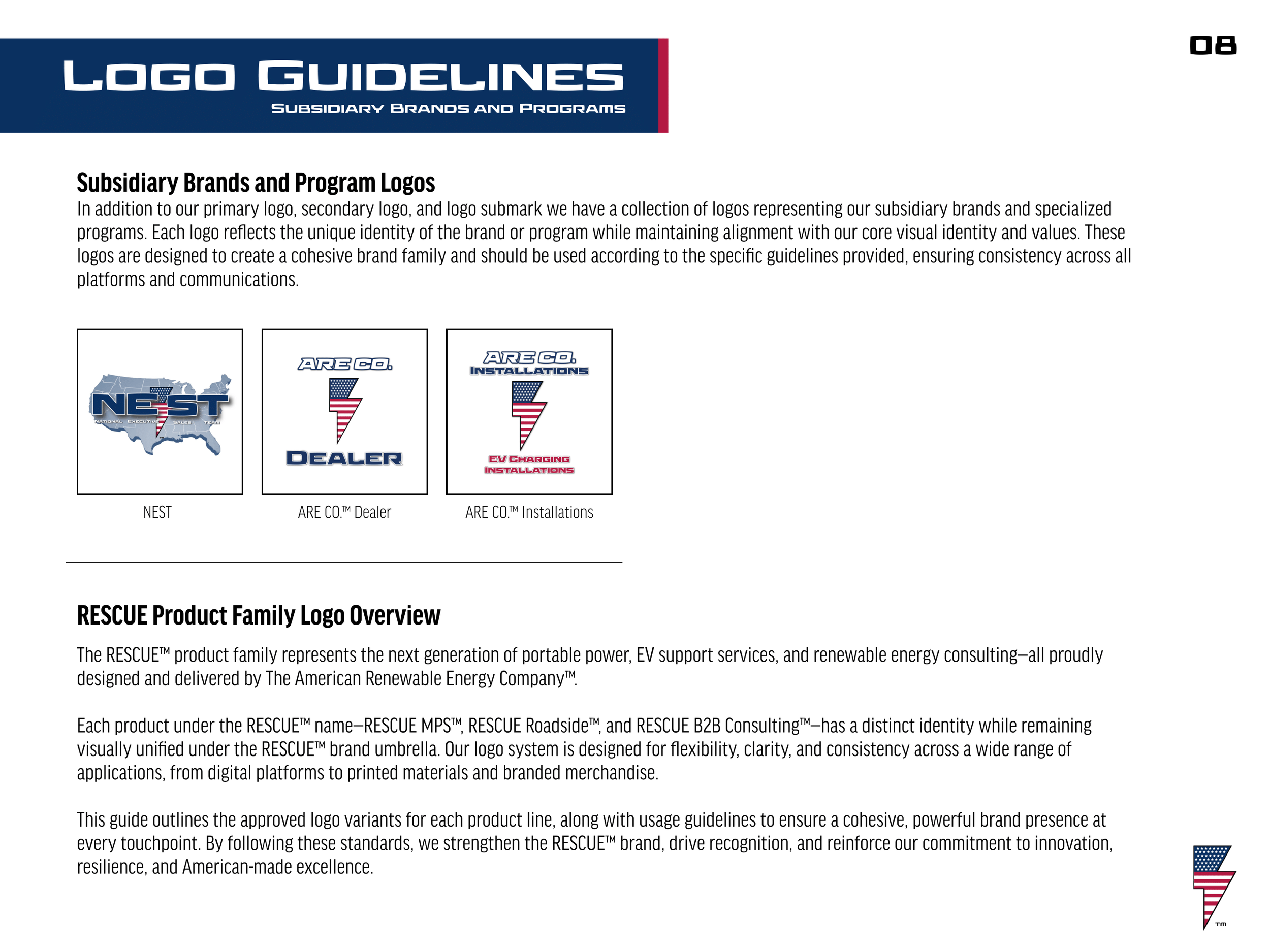
Logo Submark Creation
“Returning to my goal of expanding their brand identity I knew it was important to create a submark that could easily be recognized and scaled as their primary logo would loose readability if scaled too small.”
-
When I joined the ARE CO. team they already had a primary logo they were happy with. Returning to my goal of expanding their brand identity I knew it was important to create a submark that could easily be recognized and scaled as their primary logo would loose readability if scaled too small. The new submark maintains the identity of the primary logo while simplifying it down to its essence.
Sub-Branding Logo Creation
“My goal was to create distinctive sub-brands that felt deeply connected to the core brand of the company. By tying in the lightning bolt symbol, brand typeface, and brand color palette each sub-brands feel connected yet distinctive.”
-
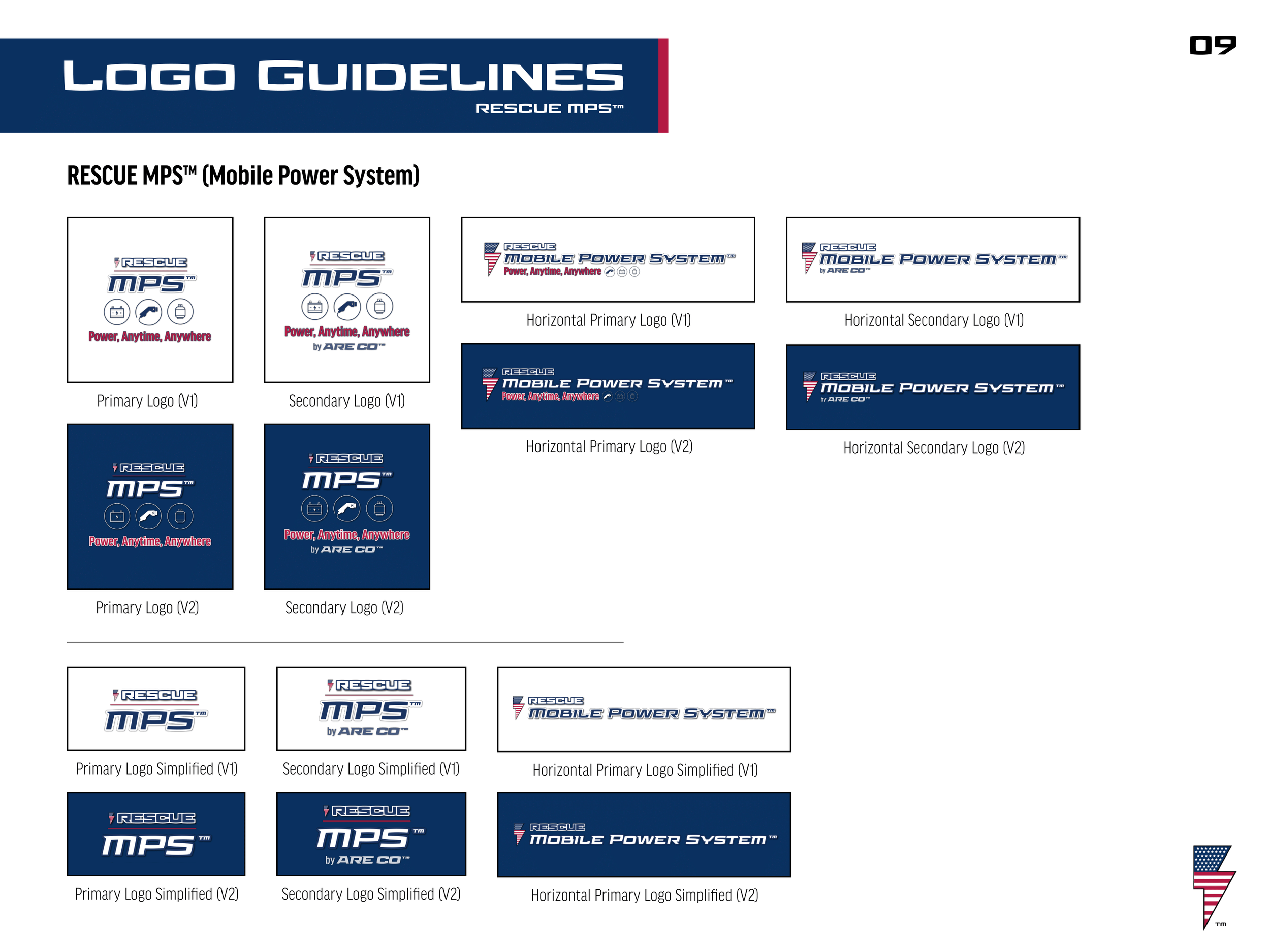
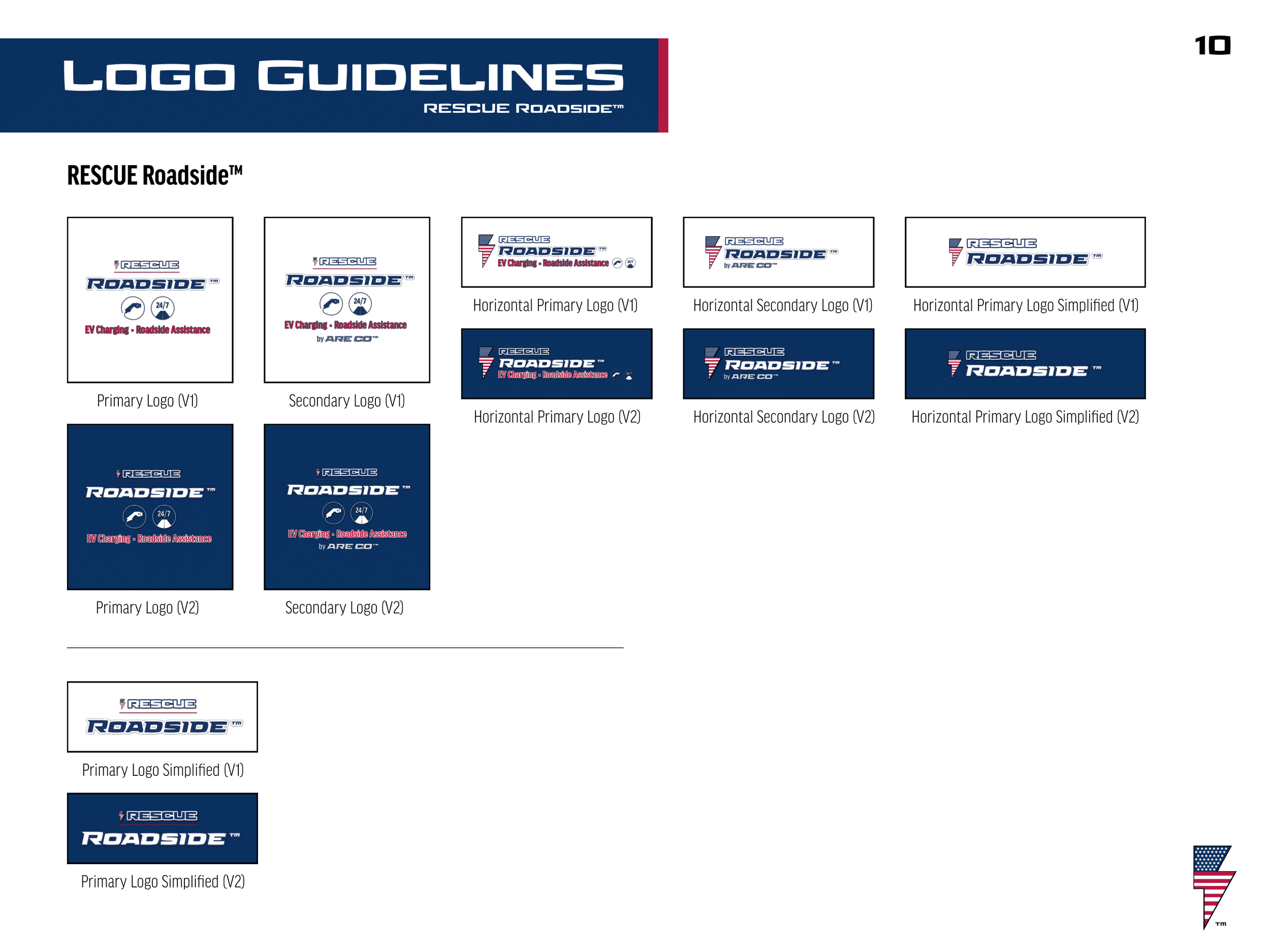
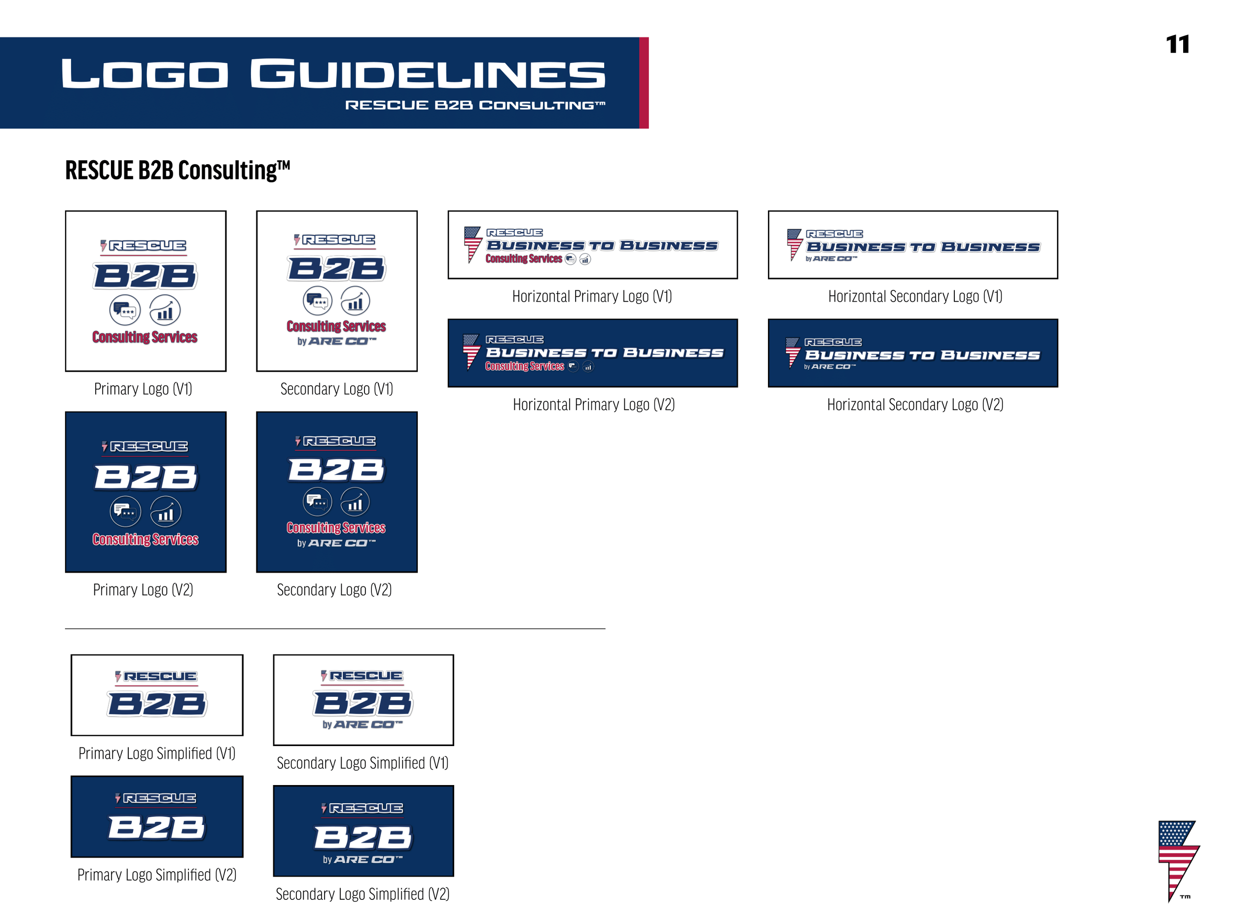
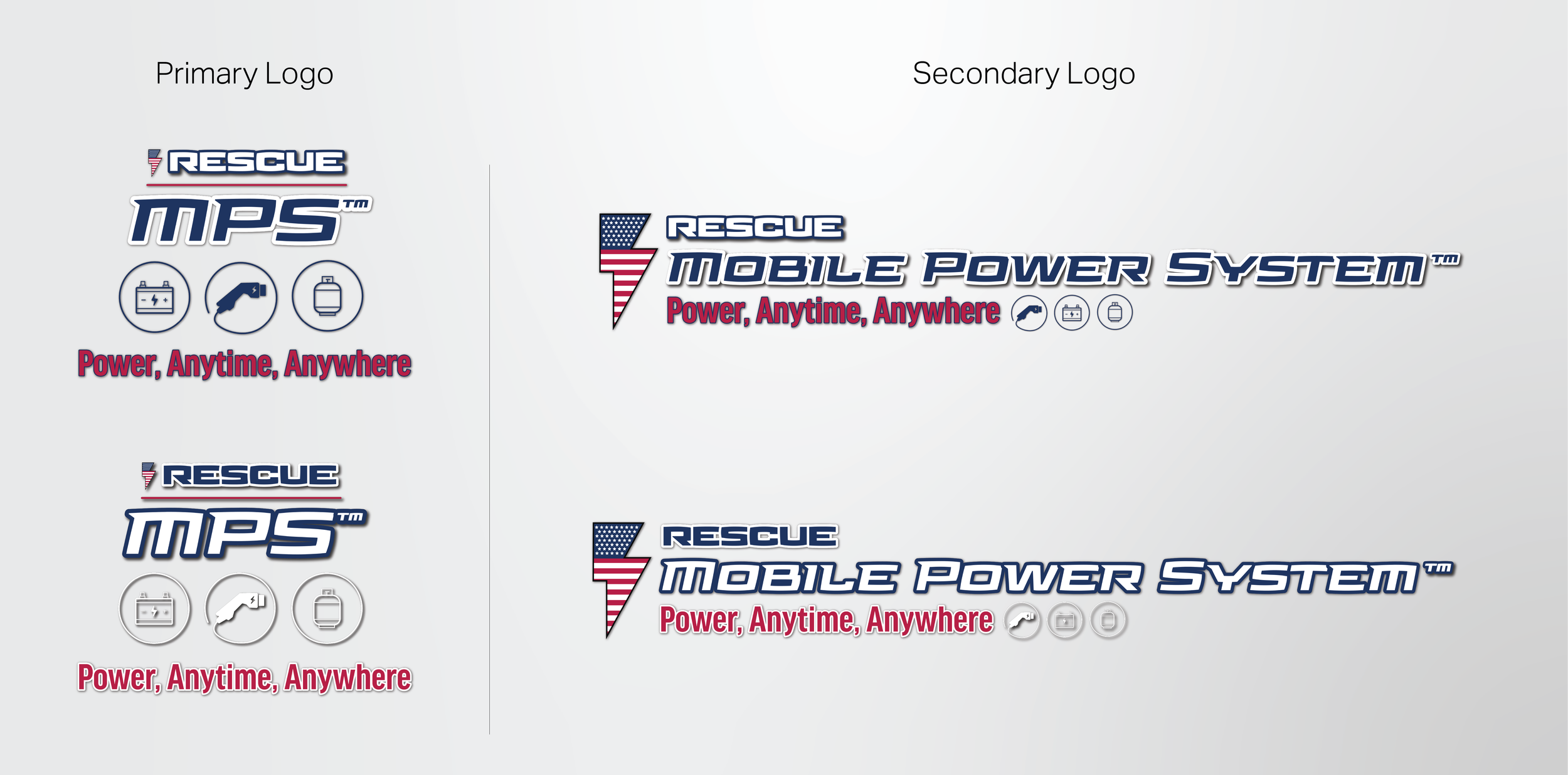
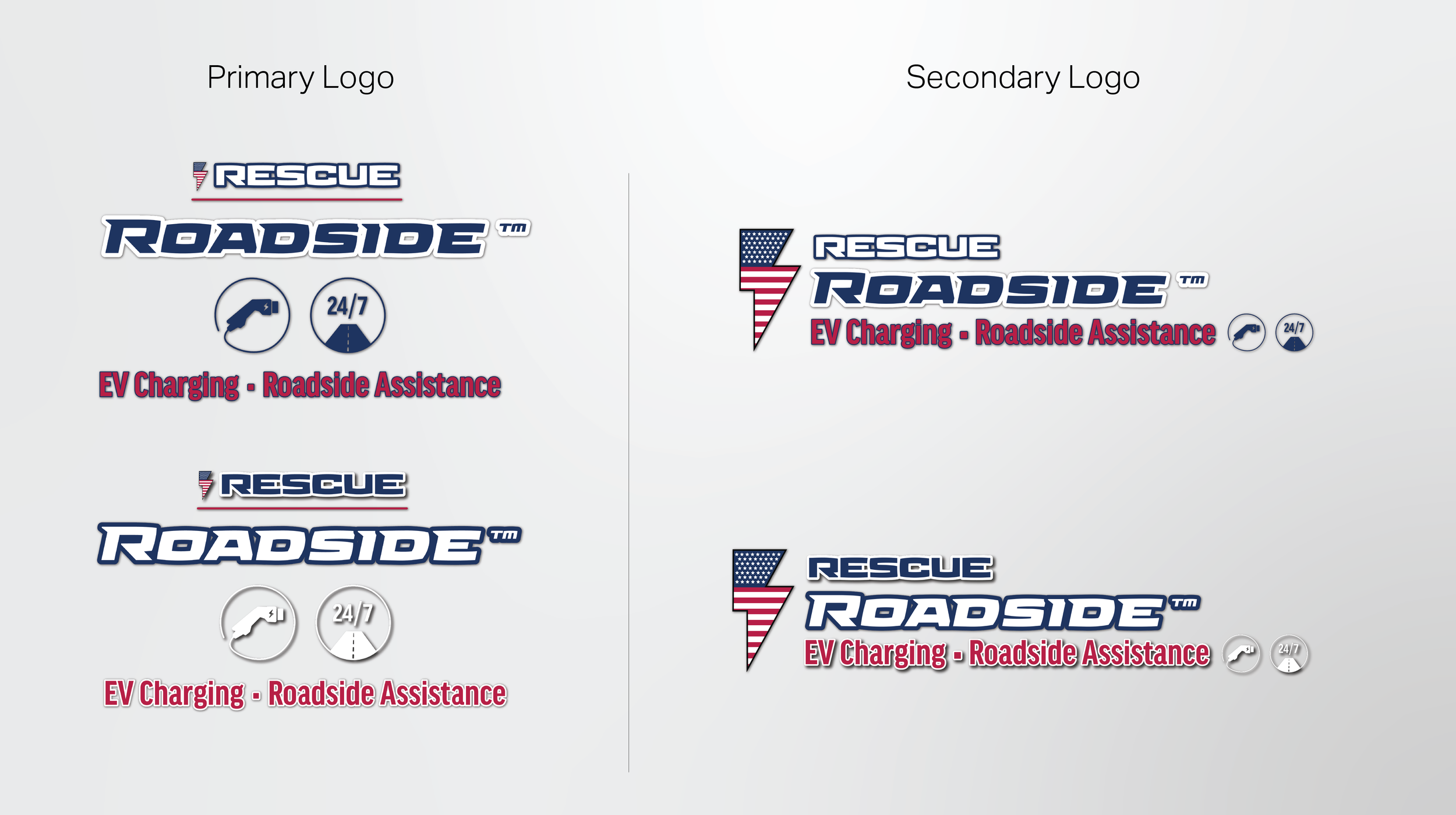
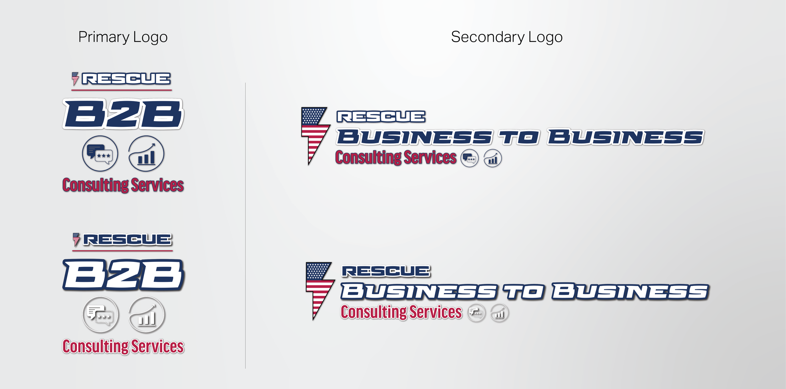
One of my first tasks at the company was to create logos and brand identities for three of ARE CO.’s sub-brands, RESCUE MPS, RESCUE Roadside, and RESCUE B2B. My goal was to create distinctive sub-brands that felt deeply connected to the core brand of the company. By tying in the lightning bolt symbol, brand typeface, and brand color palette each sub-brands feel connected yet distinctive. The circular icons showcased across each of the logos highlights their individuality while still maintaining their connectivity. I created a primary and secondary logo for each and outlined in the brand guide specific instructions on how/when each should be used.
-
![]()
RESCUE MPS Logo Variations
-
![]()
RESCUE Roadside Logo Variations
-
![]()
RESCUE B2B Logo Variations
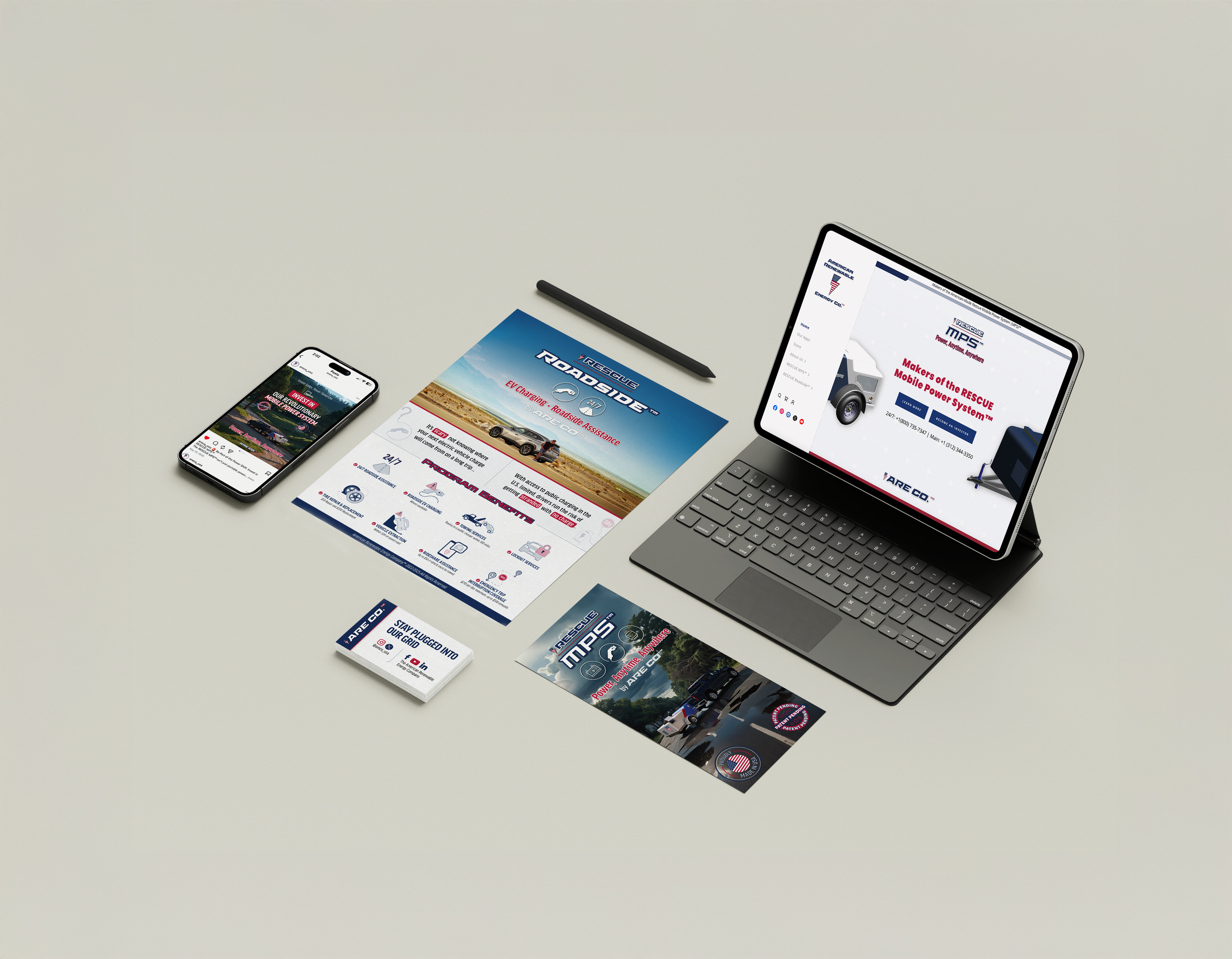
Developing Marketing Collateral
“Whether it was standing banners, flyers, brochures, business cards, or presentation decks, no matter what collateral I was creating it was important that each design was instantly recognizable as an extension of the ARE CO. brand.”
-
Throughout my time at ARE CO. I created countless iterations of an array of marketing collateral. Whether it was standing banners, flyers, brochures, business cards, or presentation decks, no matter what collateral I was creating it was important that each design was instantly recognizable as an extension of the ARE CO. brand. The brand guide I created was an invaluable asset when creating these materials. By being thorough with the brand guide in the beginning I was able to quickly create multiple design iterations for any design request that was sent my way.
-
![]()
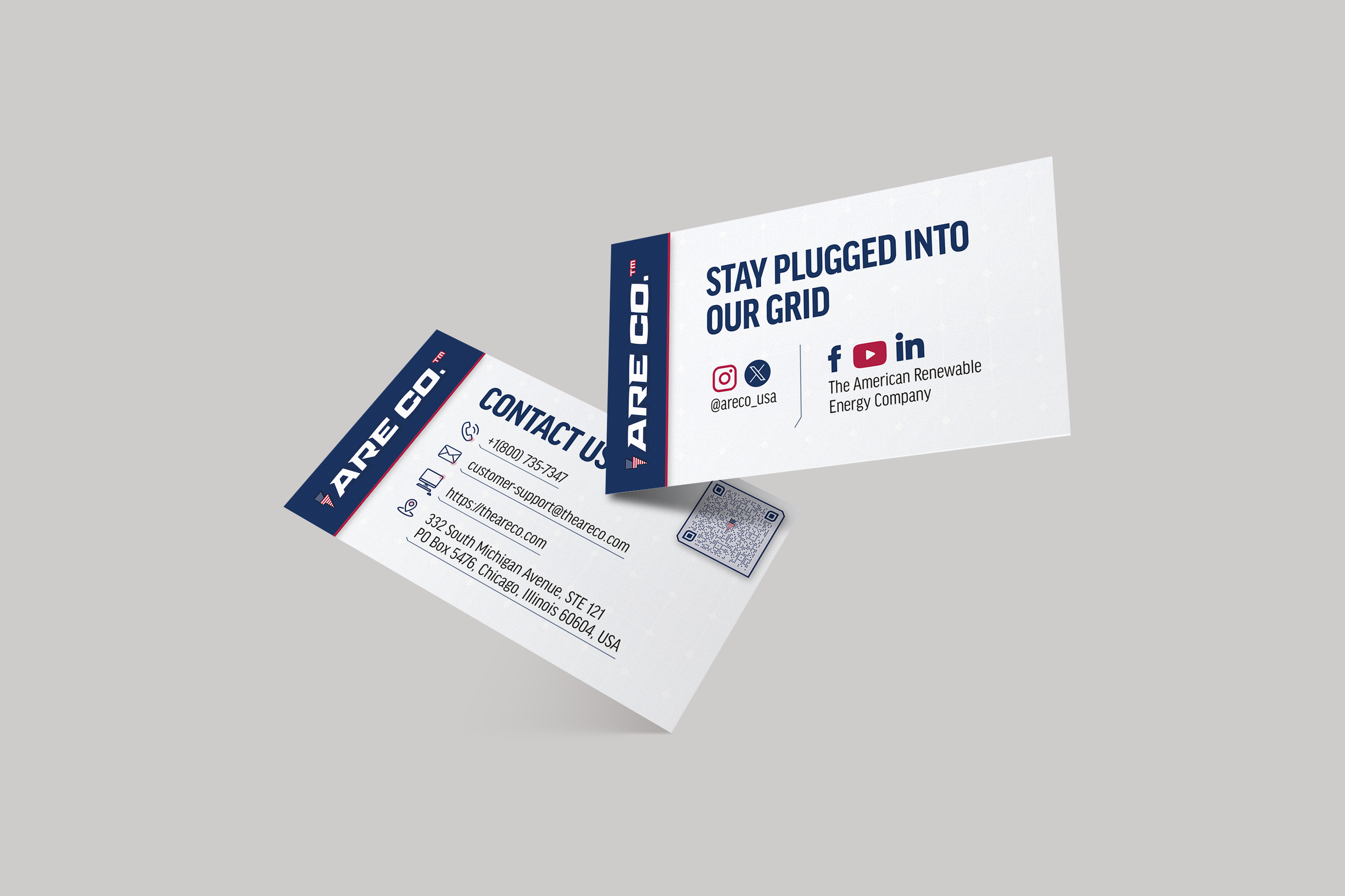
Contact Us Business Card
-
![]()
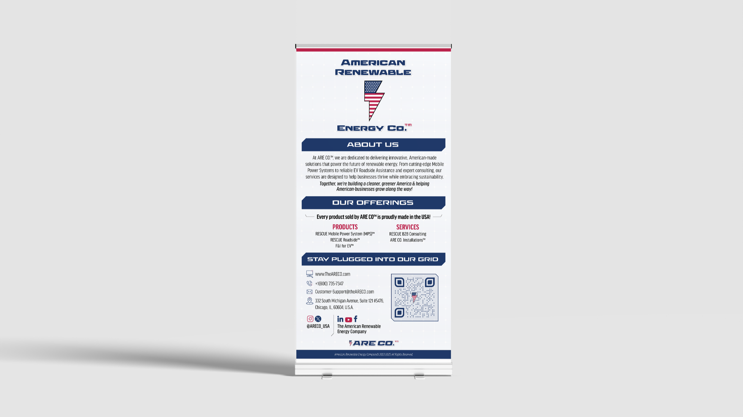
About Us Banner
-
![]()
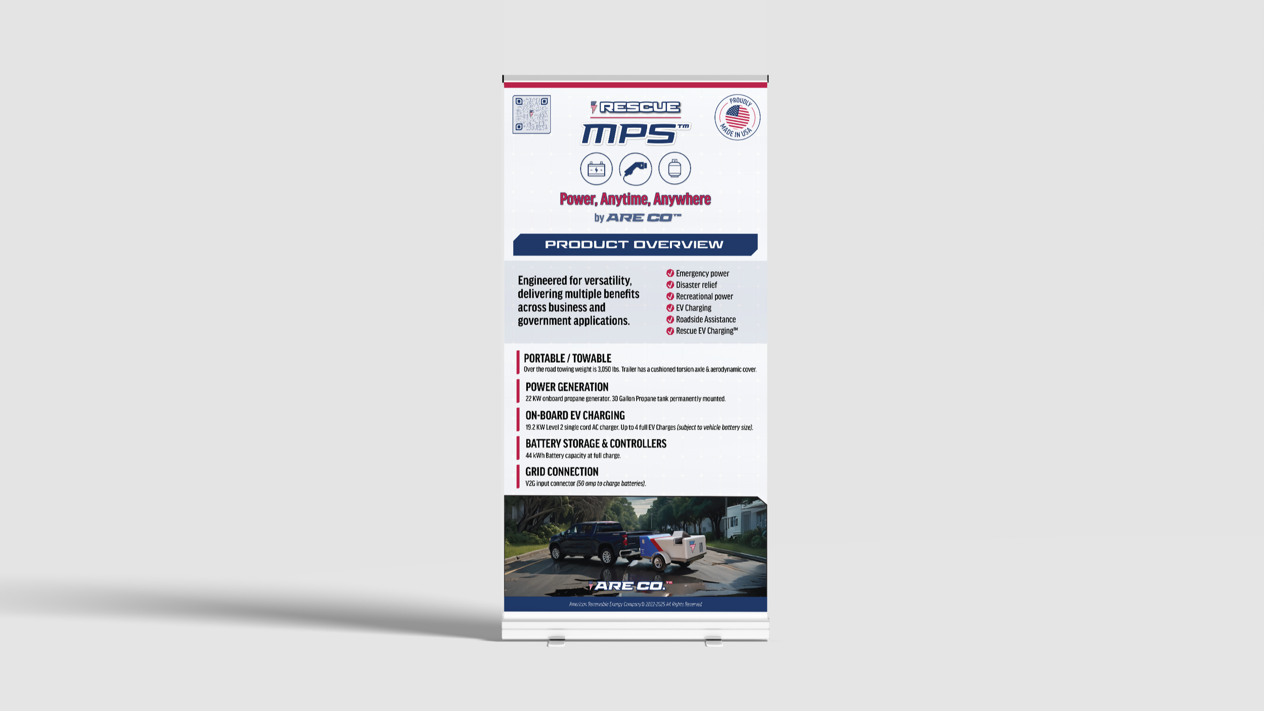
RESCUE MPS Banner
-
![]()
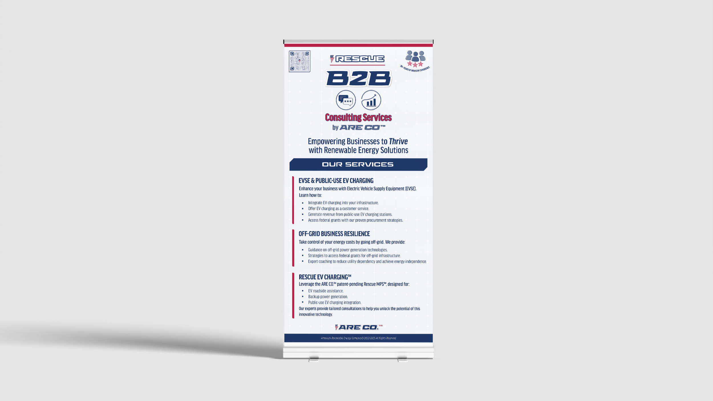
RESCUE B2B Banner
-
![]()
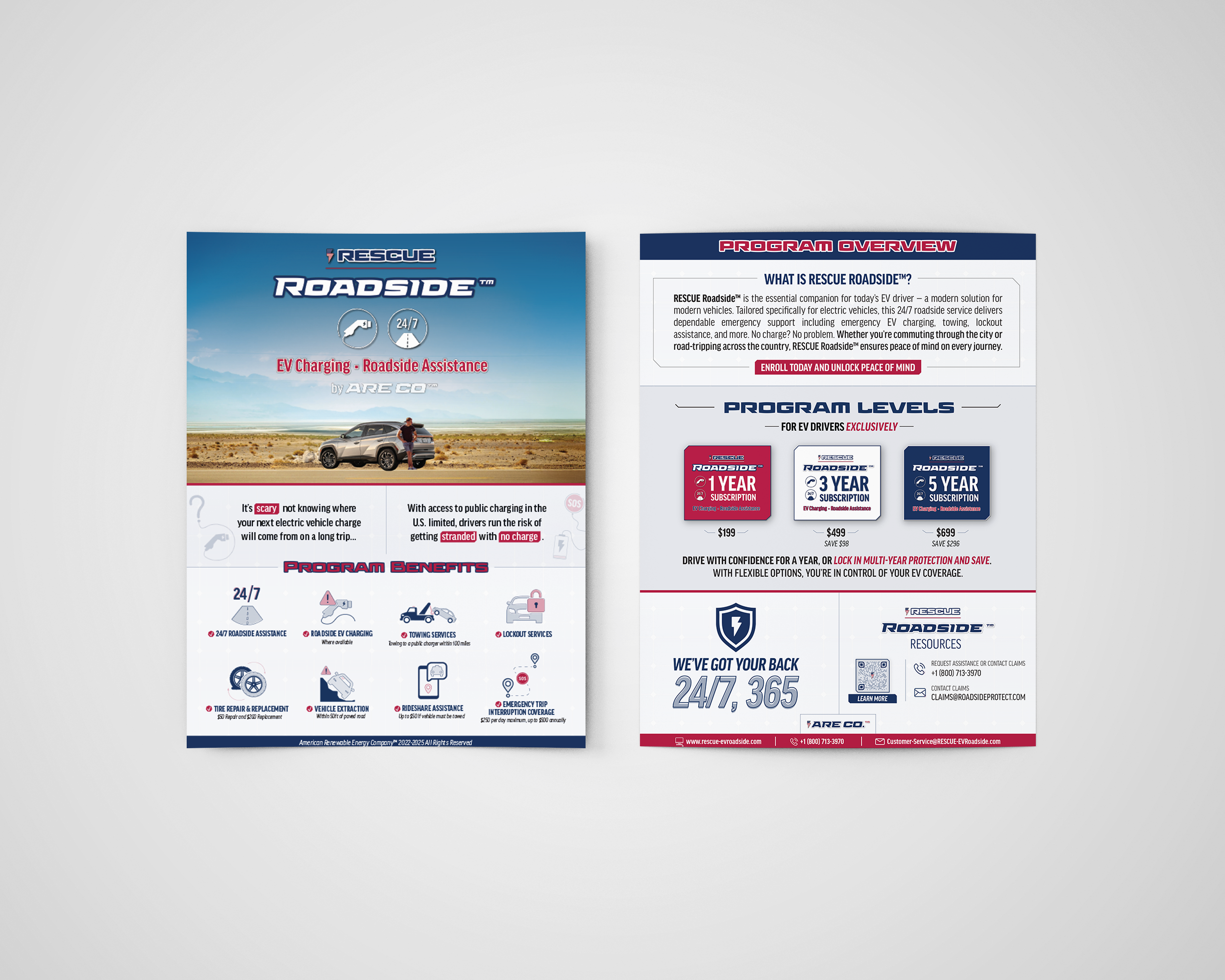
RESCUE Roadside Flyer
-
![]()
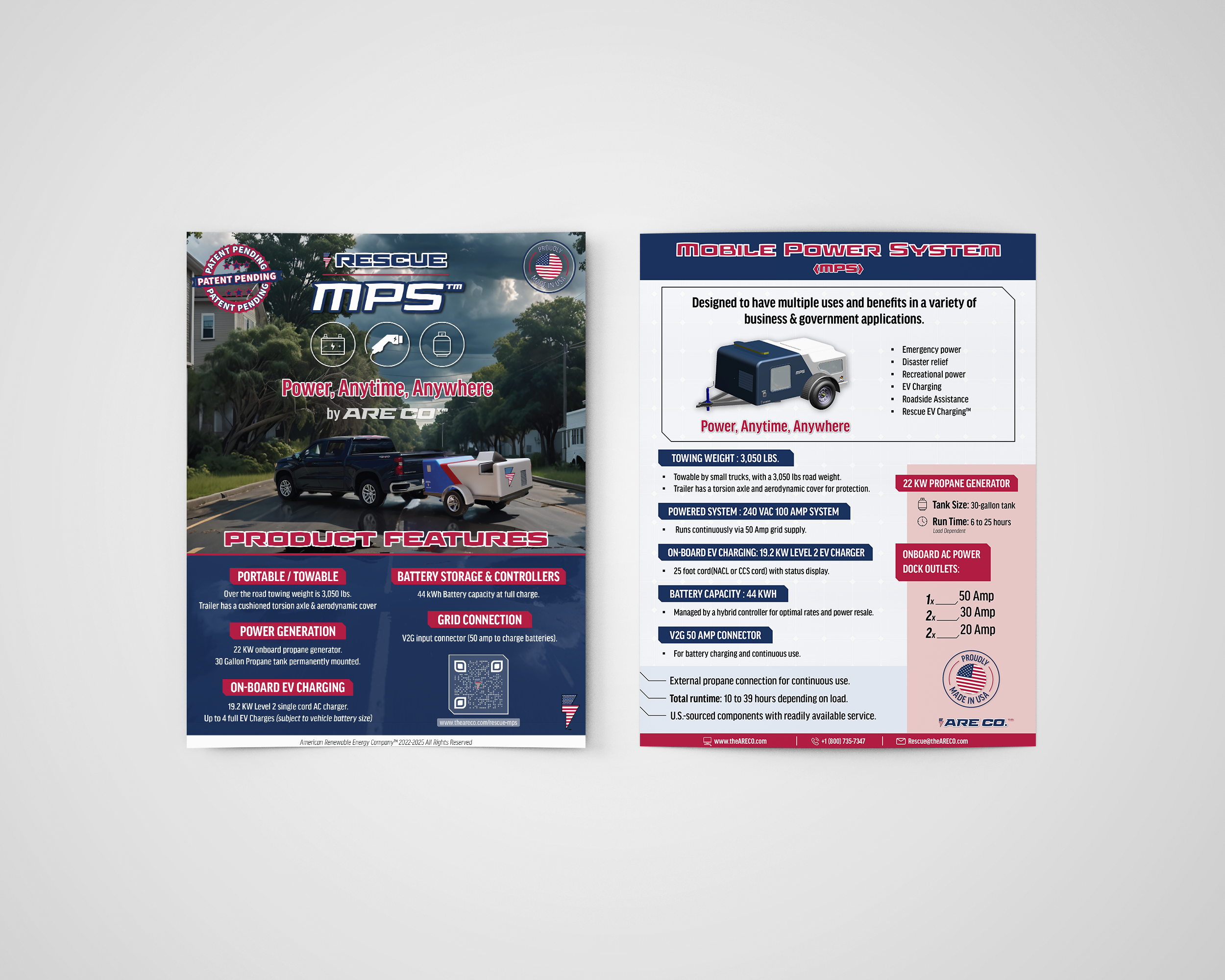
RESCUE MPS Flyer
-
![]()
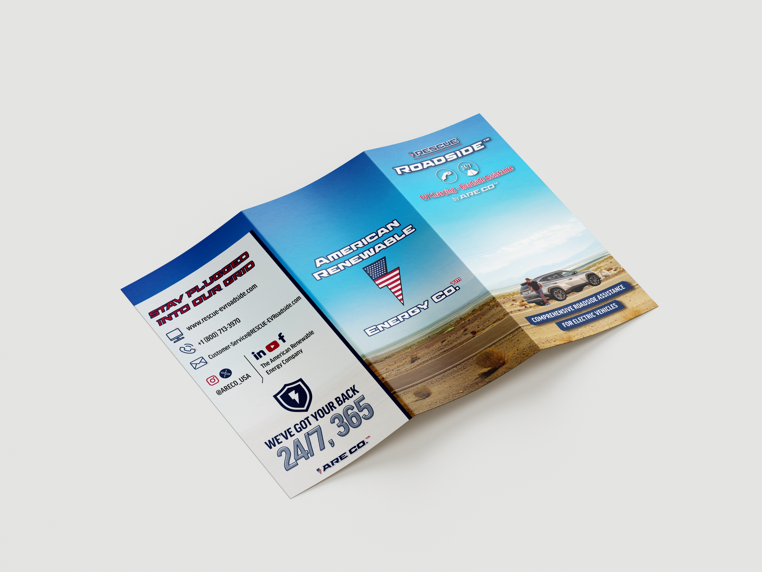
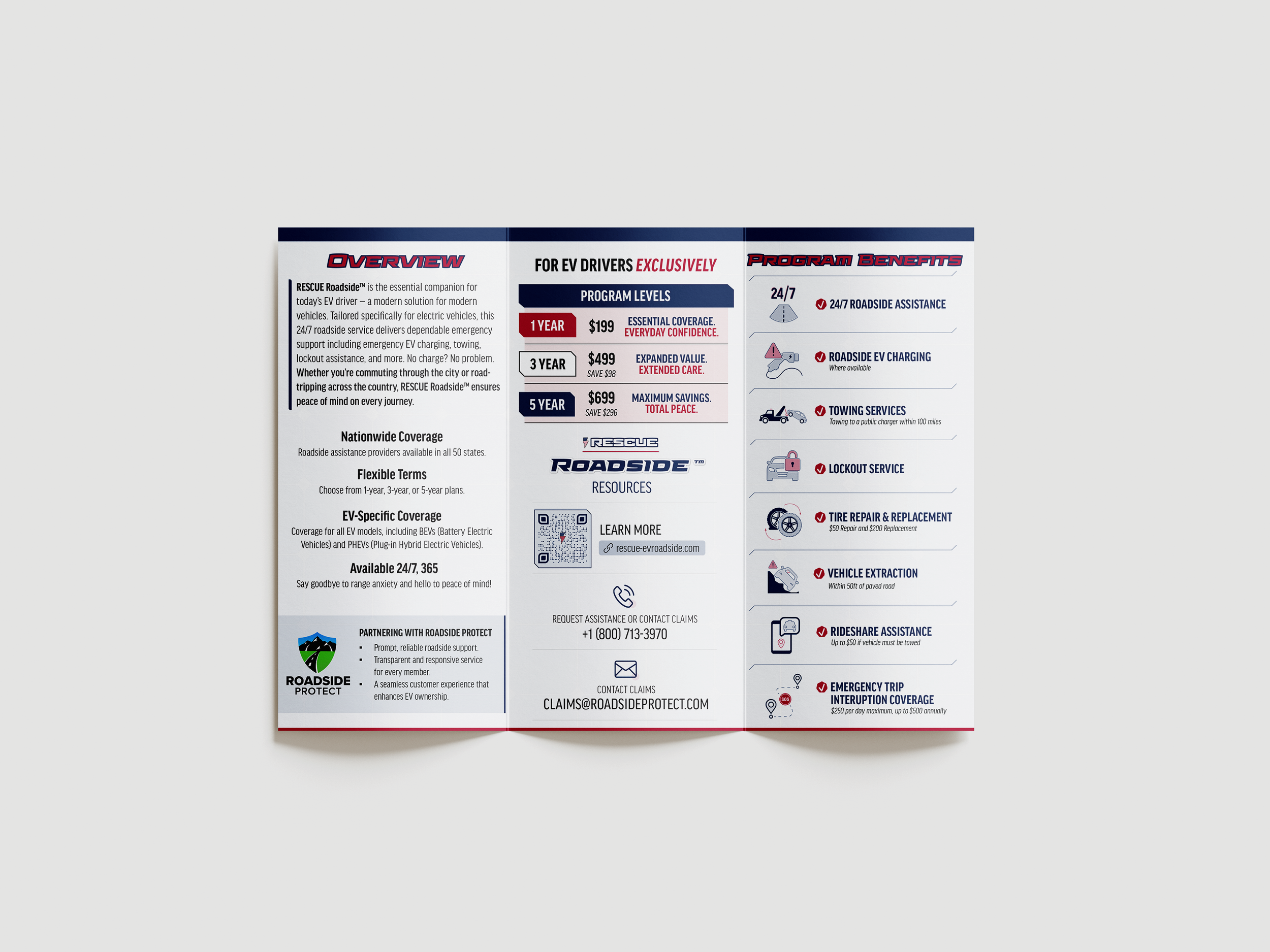
RESCUE Roadside Brochure [Outside]
-
![]()
RESCUE Roadside Brochure [Inside]
Social Media Management
“My goal of developing and expanding ARE CO.’s brand identity to create a memorable and cohesive brand identity system maintained consist across all of my responsibilities and was especially crucial when managing their social channels.”
-
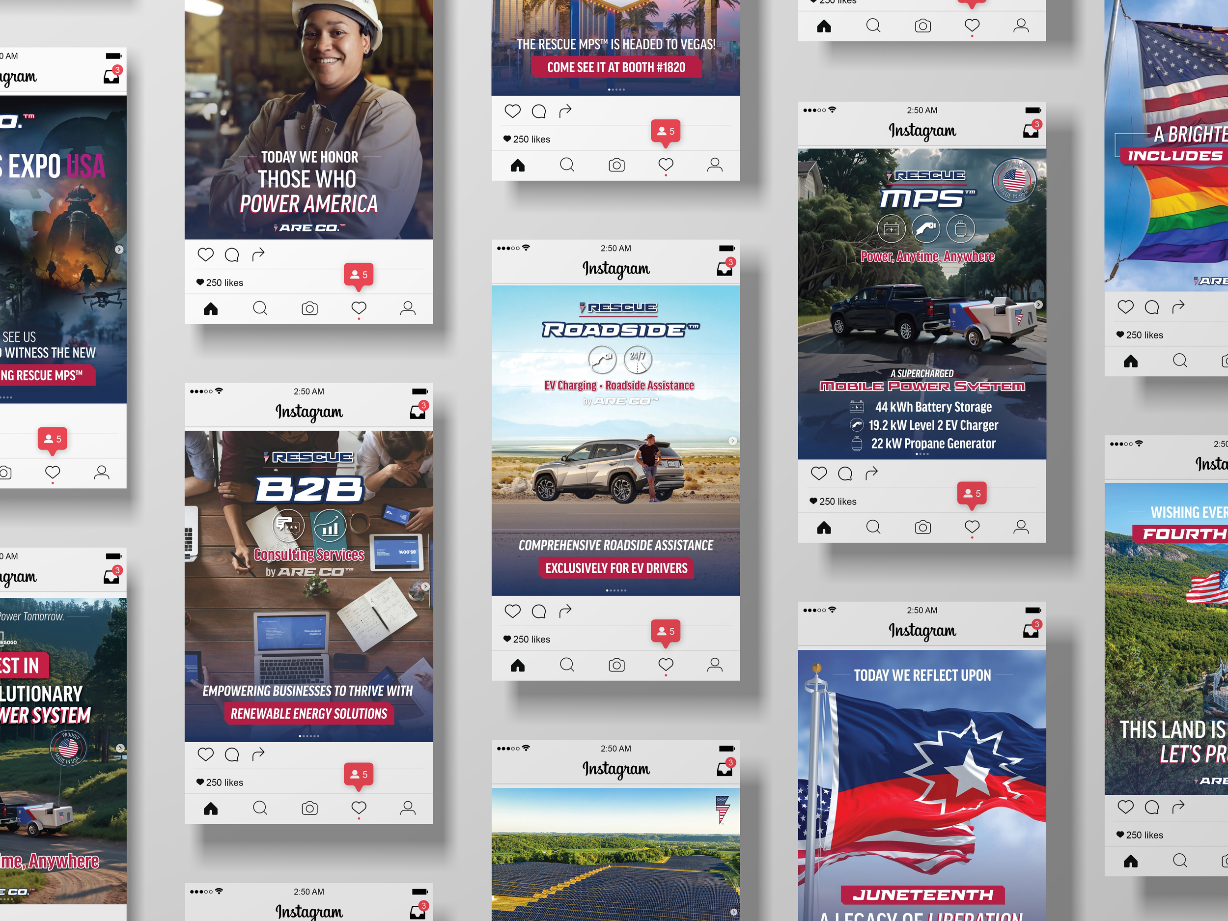
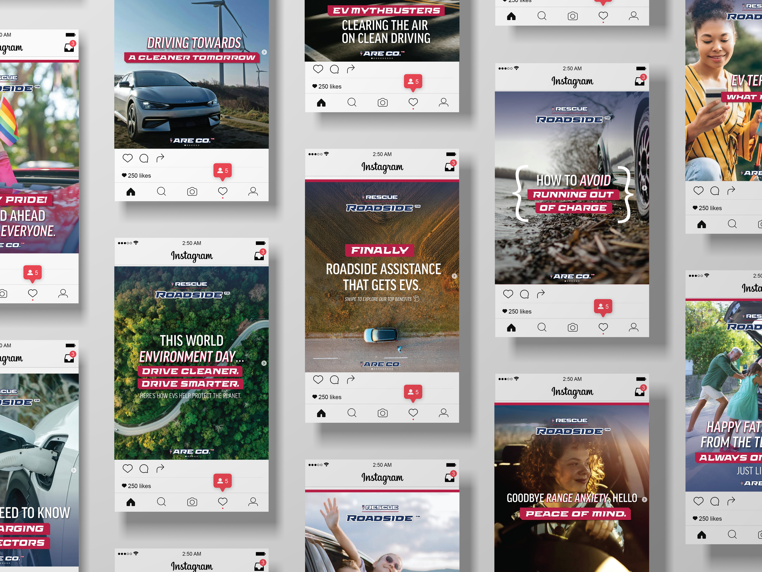
In addition to being in charge of the overall ARE CO. brand I was also responsible for managing their social media channels. The company primarily utilized Instagram, Facebook, and LinkedIn and I designed posts and created copy to be used across all channels. My goal of developing and expanding ARE CO.’s brand identity to create a memorable and cohesive brand identity system maintained consist across all of my responsibilities and was especially crucial when managing their social channels. It was important to me that even if you took away their logo that each post would still feel like it came from ARE CO. I achieved this through using a consistent design system and following the brand voice and tone guide outlined in the brand guide I created.
Final Takeaways
“Every touchpoint of a brand is an opportunity to strengthen and reinforce the brand’s identity… A successful brand is able to hold the tension of feeling consistent and predictable while still feeling new and surprising. I strive to create strong brand identities that can hold that tension with ease and stand the test of time.”
-
Working at ARE CO. was such a deepening experience for me, it provided me the opportunity to flex and sharpen my skills pertaining to design, project management, marketing, and advertising among many others. For the first time I had complete creative control over the brand I was expanding and I learned some invaluable lessons along the way. One of the more important lessons that I learned was the importance of developing a clear brand identity from the start. When you take the time to be thorough and clear about the identity of your brand you are setting not only yourself but the entire company up for success. A well thought out brand can make or break a company. The importance of a detailed brand guide cannot be overstated. An iconic brand should be easily recognized and memorable. Every touchpoint of a brand is an opportunity to strengthen and reinforce the brand’s identity. Consistency is what helps build that strong brand identity and consistency starts with a well thought out brand guide. A successful brand is able to hold the tension of feeling consistent and predictable while still feeling new and surprising. I strive to create strong brand identities that can hold that tension with ease and stand the test of time.